Sentiment Analysis Data Visualization
on Mobile App Reviews

IMO is the tool for the questions
IMO is an interactive data visualization tool that provides the user with a way to navigate, visualize, and draw comparisons between applications for mobile devices.
The user can use advanced tools such as sentiment analysis to construct graphs that would better illustrate how an app is performing at a selected time due to which factors.
IMO is the acronym for 'in my opinion', which in this case refers to the emotional response for mobile apps.
Role:
UX Designer
Web Developer
Tools:
Illustrator
d3.js
42 matters API
01.
DEFINE
Goals: Identify the scope, users, and aims of the project.
Deliverables: Related Works/ Data & API/ Target Audience
Related Works
Traditional review analysis based on the bag of words data
To gain insights and draw inspiration from the existing works related to sentiment analysis on the mobile app market, I referenced over 15 academic papers and tons of data visualizations.
Thus far, there has been little work done in the field of custom visualizations of app store data. Moreover, most similar projects do not provide much direct comparison between applications. The scope tends to be limited to one source, free apps only, or out-of-date data.
Some of the projects discuss how to collect, parse, and analyze the mobile app's review data. Still, it is difficult to determine the sentiment accurately. In general, we used the word bags to define the attitudes of the reviews.
Data & API
We used data from the Apple App Store and the Google Play Store.
Dataset provides basic information such as genres, ratings, links to the app icons, a description, the number of updates, and other data that has been parsed and formatted neatly.
Thanks to the 42 matters API, which provides additional sentiment Analysis for the app’s reviews, we were able to built IMO by querying the API dynamically.
Each review may be sorted into a category depending on keywords and phrases found in the reviews, such as “Update” and “too many ads.” These categories are then given a positive sentiment score and a negative sentiment score which sum to 1.0; for example, a category might be 0.6 positive and 0.4 negative.

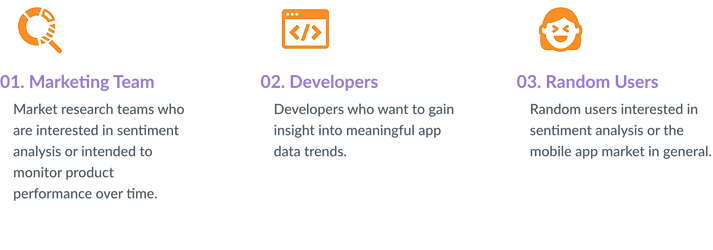
Target Audiences
02.
DESIGN
Goals: Design the visualization with best expressiveness
Deliverables: Sketch & Brainstorm/ Wireframes/ Colors/ Layout/ Interactions
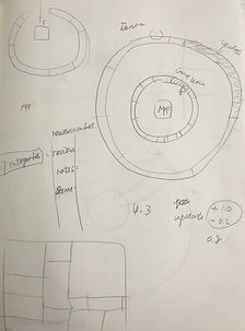
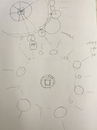
Sketch & Brainstorm
By synthesizing the information and diving deep into the dataset, I find some fascinating patterns.
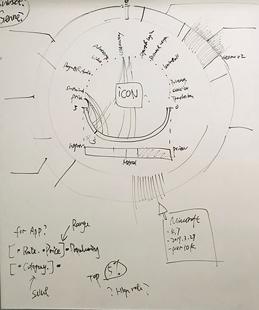
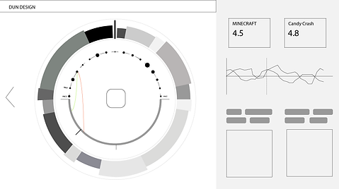
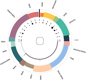
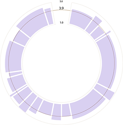
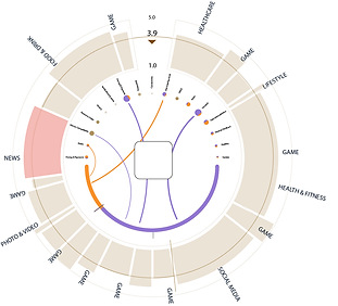
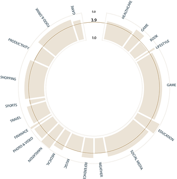
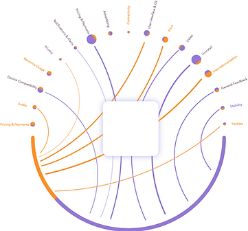
The overall rating range of the app is fixed on a scale from 0 to 5. There are up to 17 different categories of reviews. Each of them can contribute to the app rating as either a negative or a positive value.
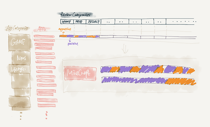
Keeping the data structure in mind, I decided to roll up the rows and create a circular network diagram, in which the size of the bubble reflects the number of reviews received in each category, and the width of the stroke shows the contribution to the final rate.
Then, I present my initial thoughts to my engineer friend to gain feedback and assess the feasibility of the design.
Paper & Whiteboard
Sketches
Wireframes
I created wireframes, helping the developer and me to focus on the functionality, behavior, and priority of content through further iterations.
Colors Exploration
“Get It Right in Black and White” - Maureen Stone
ATTEMPT 01.
Full-Color Ring on App Category
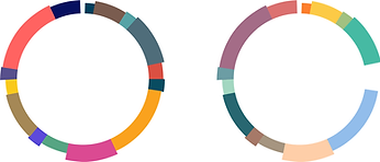
I attempted on using different colors as visual marks to differentiate different app categories. After exploring a few color schemes, I realized that this is distracting the user from the sentiment analysis.
ATTEMPT 02.
Dominant Color and Attitude Colors


Moving forward, I decided to use mono-color + labels to visualize the app categories.
I picked orange and purple for the two representative colors, which are one of the most robust comparison pairs that distance 180-degree on the color wheel.
ATTEMPT 03.
Dominant Color and Attitude Colors
I made final color adjustments based on user interactions such as selections, hovering over, and muted.
Layout
“Out of sight 👀, out of mind” - John Heywood
The “out of sight, out of mind” mentality about missing information: users tend to forget the elements that have been filtered out, even when their absence is the result of recent actions.
The disjoint interaction (scrolling) in the vertical layout has a more detrimental effect on the experience than the compromised readability in a horizontal layout.
Based on this fact, I chose the horizontal layout in the final design.
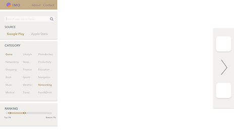

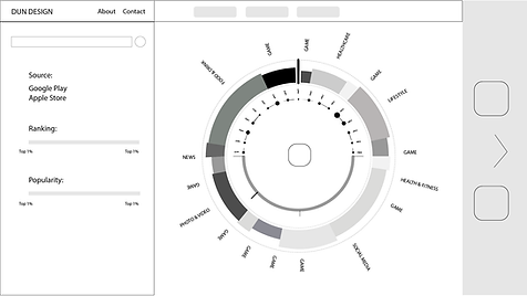
Arranging the overviews and detail, I designed a sidebar that shows the selected apps.
Floating filter sections on the right will become a label on the top.
Interaction Design
“Overview first, zoom and filter, details on demand.” - Schneiderman's Mantra
A single static view can show only one aspect of our dataset; therefore, I designed an interactively changing display that supports multiple queries, visual feedback, and responsiveness.
02.MESO LEVEL
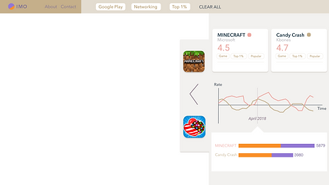
Exploration of Per-App Analysis
After the user selected the app genre, filters will present and guide the user to choose where to drill down to inspect in more detail.
The matched items will show on the corresponding category After applying the filter.
01.MACRO LEVEL
Overview of Market Analysis
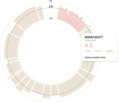
I designed a sunburst pie chart to show a broad awareness of the entire market space. The height of each pie represents the average rating of each category.
03.MICRO LEVEL
Exploration of Sentiment Analysis
After selecting the app, the sentiment analysis of the app reviews will display in the center.
03.
CONDUCT
Goals: Build, evaluate, and deliver the project
Deliverables: User Performance Experiment/ Evaluations/ Future Steps/ Reflections
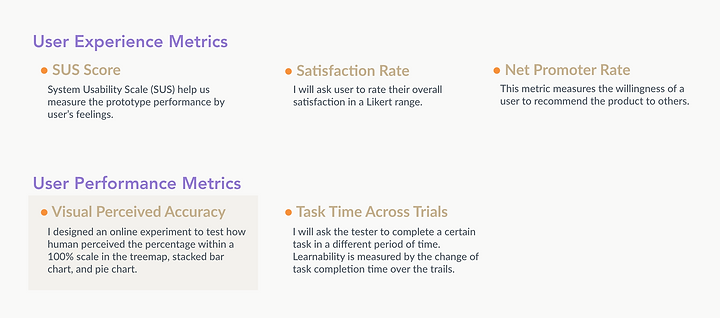
Evaluations
We decided to measure the expressiveness of the system on two aspects: User performance and User experience. See below.


Reflections
I should have explored the dataset, such as creating a scatterplot, to get a better understanding of the outliners and edge cases.
Color should convey certain emotions. I should have a clear reason for using that specific style as sentiment information is tricky.