SomeoneLikesYou
A community that helps people living with diseases to connect, share, and improve outcomes together.


Loneliness is the real harm to patients and caregivers
General social-networking platforms are designed “to communicate the impression of being interesting people who [are] in control, positive, and not struggling”.
What if we are no longer there?
This is a project devoted to this vitally actual theme and presented to those patients who are struggling and suffering from loneliness.
The Story and Background
This is my first foray into product design
I used to be a regular volunteer at an Autism school. I found that parents of autistic kids are under huge pressure and eager to meet someone who understands their struggles.
Inspired by my experience and an existing community, PatientsLikeMe, I decided to build an app that helps people and their caregivers connect with peers.
Role:
Designer +Owner
Team:
Self-directed, with feedback from mentors and peers.
Duration:
April 2019, 7 weeks
SOLUTION
Onboard with Chatbot
"Hi, let's get to know you."
CHALLENGE
How to make the app easier to start?
SOLUTION
Explore Treatments
Together, better outcomes.
CHALLENGE
How to help patients get the most out of the community?

SOLUTION
Create "Labels"
"You are not alone. I know how it feels."
CHALLENGE
How to help members identify peers by a glance?

SOLUTION
Send Anonymous Post
One community we all here.
CHALLENGE
How to encourage members to share?
01.
RESEARCH
Competitive Analysis
I acted as a member of those platforms to experience their services.

I distill the values from the existing products.
I position them into two dimensions: the focus of the product and the user activeness.
I also registered as a user in 3 of them: PatientsLikeMe, DailyStrength, and CaringBridge
👈 Click the icon to see the detailed review

Interviews
Having real conversations with patients and caregivers in my network
I interviewed users of mixed gender, age, and health conditions to reach better generalizability.
I set the criteria based on the market analysis by creating proto-personas, which helped me narrow down user groups:
Rigid demand user, elastic demand user, and random users.
When designing the interview questions, I kept the question open enough to avoid the situation that I only get the results that tally with my assumptions.
Tester number: 7
Gender: 5 female/ 2 male
Age: 22-45
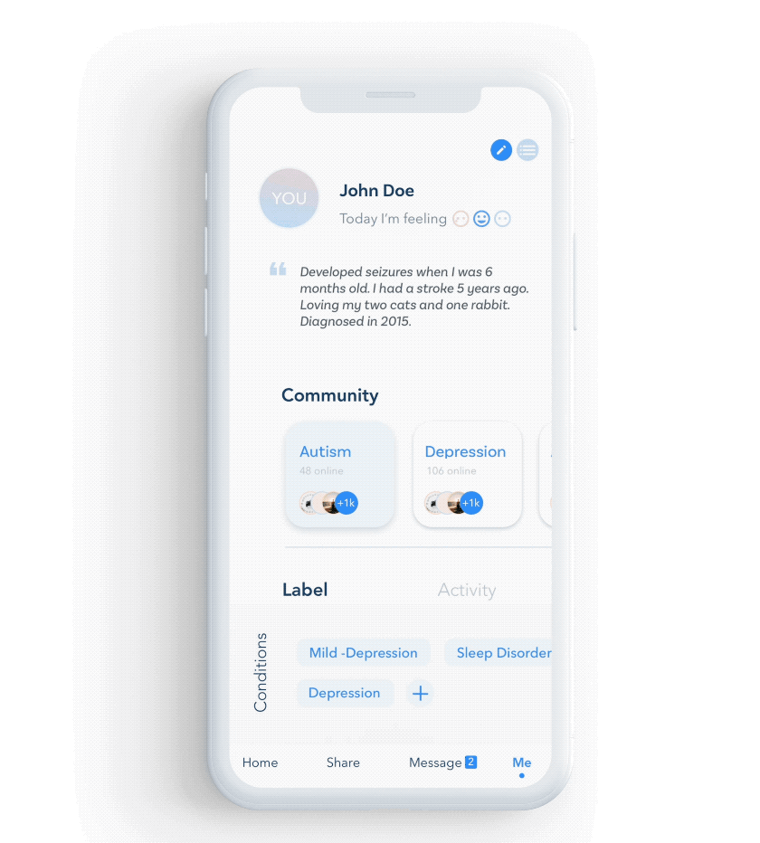
Personas
Two personas, two user groups
To represent the data synthesized from interviews, I created personas as shown.
There are two major targeted user groups. Allen, a mother of autistic children, is more motivated to connect with others. Jason is less motivated to find peers.


Affinity Diagram
Information manifests itself into groups in the affinity diagram. Those four categories clarified the range that what are the key features SLY should possess. Those categories are:
• Find peers • Share feelings • Search for solutions • Get a better experience

UX Research
The question-answer rate is higher when user interacting with the Chatbot
ChatBot has long been my interest. When identifying the pain points with users, I found that ChatBot could be a promising solution, so I designed an in-lab experiment to validate that.
The results show that the question-answer rate is much higher when using the chatbot. So I decided to design a chatbot for my product.
OR
02.
DESIGN
Product Roadmap
I have hundreds of ideas to solve a problem, but I can’t implement all of them.
Priorities are easier to filter with facts. I use the affinity diagram as evidence to shore up my prioritization decision.
Using the how-might-we questions, I underwent rapid brainstorming and designed features.

Idea Iterations
Never stop thinking + ask everyone's opinions
Keep all these things in mind, I did more research and made a few design decisions:

01. Use Bottom Navigation Bar
I opted for the bottom navigation bar instead of a hamburger bar for usability concerns and feature exposure.
02. Cancel 'Follow'
People put too much attention on the number of followers, likes, and the number of comments. It is not facilitating a healthy community.
I want people to have a bidirectional relationship and have a real conversation, so I canceled the following function, which is the most common function in social media.


03. "Hugs" instead of "Likes"
At first, I designed reactions similar to Twitter and Facebook, you can like a post. Later I find this often feels ironic when people react to post, such as others' diagnosing history and struggles.
So I replace "Likes" with "Hugs".
04. The chatbot is your first friend
I give Chatbot more meaning by adding it to the user's friend list, making Chatbot become the user's first and forever friend.
No annoying "You have no friends" empty states anymore.

Wireframing

SiteMap
It is essential to avoid ending up with a convoluted system.
I created a sitemap to visualize information architecture. I divided the sitemap into four groups, each representing a function on the main navigation.

Basic Style Guides


03.
SOLUTIONS


PRIOTOITY 1
Connect with others

PRIORITY 2
Explore stories

PRIORITY 3
Onboarding with Chatbot

PRIORITY 4
Share posts

04.
TAKEAWAYS
Reflections with Past Iterations
One of the most valuable lessons I learned is to get feedback often and early in the design process. I was afraid to show incomplete or scrappy sketches and always showed the high-fidelity prototypes to others for reviews. Every iteration takes lots of effort and it's time-consuming.
As long as I am clear about what I need from the critique, I should be confident enough to start the conversation. :)


Version 1.0
This is the first version of the app. My mentor reviewed this and we all agreed that there are too many features for a single app.
I simplify the product after this. The features I removed include self-diagnose, off-line meetups, and
medicine filters.
I only kept a few features and redesigned the app from scratch.


Version 2.0
This is the second version, which is
"clear" (with no navigation),
"trendy" (with low contrast),
"fun" (with confusing gestures),
and "cool" (with distracting animations)
This design is illegible, undiscoverable, inaccessible, and unpredictable.
So I started over.


Version 3.0
At this version, I started doing user research, such as the Chatbot one.
I got confidence in my design decisions and used more affordances visual cues to inform the users.
Also, I switch from Adobe XD to Sketch, exploring more tools and understanding the pros and cons.
Future Steps
-
Start with a niche community
I sought feedback from doctors, patients, and other product designers in the UX symposium, some of them suggested that at the initial stage, focusing on a single disease is more targetable.
-
Extend the user group
I want to allow researchers and caregivers to leverage the community content as well.
-
Be careful with security and privacy
Privacy is the first place concern, not afterward. I should design to help users protect their privacy
-
Research more on the negative side of using labels
Sometimes the cluster emerged without a push. User prejudice may harm the activeness of the platform.